Tag: Responsive-layout

With users accessing websites and applications across various devices and screen sizes, creating responsive layouts has become essential for web developers. Responsive design ensures your content looks great and functions well on everything from smartphones to large desktop monitors.


Building responsive websites with Java and Vaadin Flow
Responsive web design is an approach to building web applications that dynamically change the size or orientation of the visible elements for ideal viewing on viewports of various sizes. At various breakpoints (developer-defined numerical values of viewpoint dimensions), one may notice menus ...

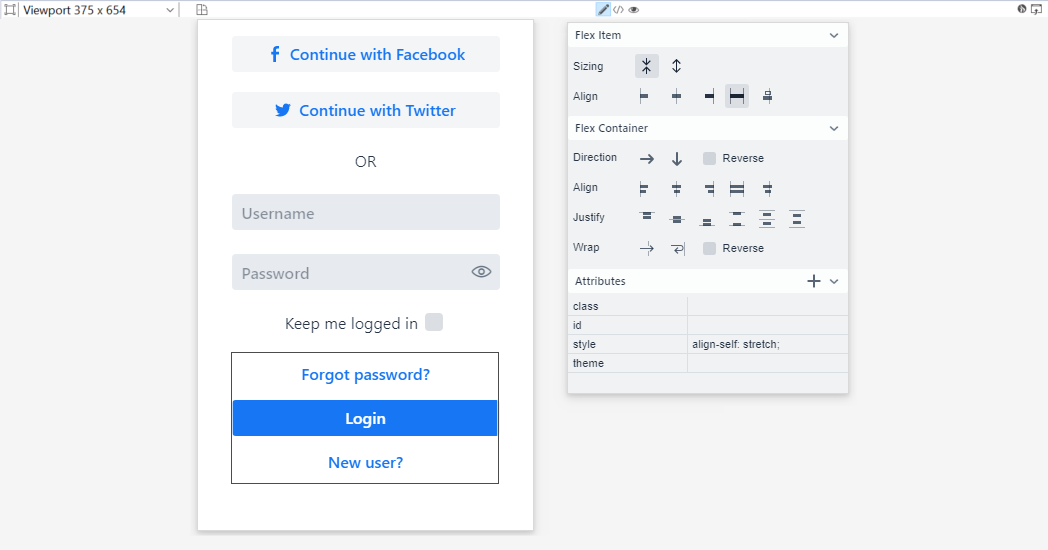
Layout views with flexbox in Vaadin Designer
Vaadin Designer 4.3.8 makes laying out your Vaadin views a whole lot more visual. Previously, you had to know and enter the CSS for your views. Now, you can edit your flexbox layouts using simple controls in the properties panel. You will also learn flexbox in the process! The main building blocks ...

Responsive Design Made Easy with CSS Grid and Web Components
A simple responsive layout example without any tricks nor manipulating DOM with JavaScript. Responsive design is used to create good user interfaces across all display sizes and devices. Generally, this means the size, position, and visibility of each section within the UI is dependent on the ...